A hotel's print year, in order.
-
01
Arrival Has to Explain Itself
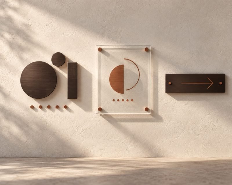
Entrance signage, valet notices and directional panels work on people who have been travelling for hours and do not read carefully. Short wording, large type and consistent arrows do more here than any amount of styling. A guest reading at walking pace with a suitcase has about two seconds for each sign.
-
02
The Corridor Is Pure Navigation
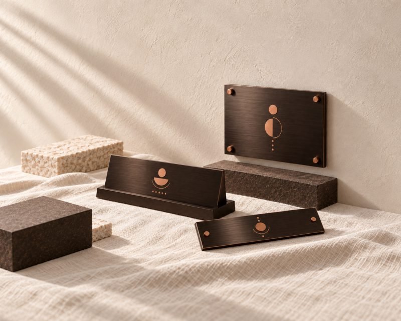
Lift lobby panels, floor numbers and room numbering run the length of the building and have to survive trolleys, luggage and cleaning. Plates and panels are specified for abrasion here, not appearance.
-
03
The Room Is Where the Brand Is Quiet
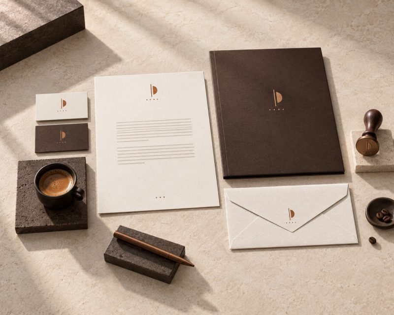
Compliment slips, notepads, door hangers, laundry lists and a directory sit in a room that guests judge by how coherent it feels. Nothing should look like it came from a different hotel.
-
04
Dining Changes Faster Than Anything
Restaurant menus, bar lists, breakfast cards and table numbers change with seasons, chefs and licensing. These are the highest turnover printed items in the building, which is why covers and inserts are kept separate.
-
05
Events Need a Different Scale Entirely
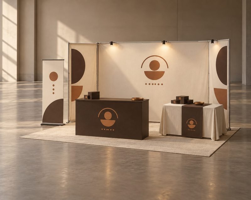
A banqueting suite running a conference needs backdrops, stage branding, directional signage and badges, often for one day. That work arrives and leaves inside a week and has nothing in common with the rest of the hotel's print.
-
06
Back of House Still Counts
Safety notices, department plates and stock labels are not seen by guests but are seen by staff constantly, and they are the items most likely to be a photocopy on a wall. Printing them properly costs very little and stops a corridor looking neglected.
One limitation worth stating. A hotel brand standard usually specifies colours we cannot match identically across every material, because a plate, a menu card and a vinyl panel take colour differently. We get them close enough that nobody notices, and we will not claim exact.
See wayfinding signage, name plates and event branding.